Saturday, 26 May 2012

Core project: Task 6 Photoshoot 3 Final Images

YoSushi!

Assorted Nigiri

Avocado Maki

California Inside Out

Crispy Salmon Skin Inside Out 

Dorayaki

Inari Pocket

Prawn Nigiri

Salmon Dragon Roll

Salmon Selection

Smoked Salmon & Cream Cheese Inside Out

Spicy Beef Nigiri

Spicy Chicken Inside Out

Spicy Mini Tuna Inside Out 

Veg Natsu Maki

Yo Roll 

Tamago Maki 

Core project: Task 6 Photoshoot 2 Final Images

Mamma Mia- Italian

Calzone

Cannelloni 

Vegetarian Cannelloni

Duck Al Pepe

Garlic Mushrooms

Pizza


Lasagna

Pasta Carbonara

 Penne arrabbiata con olive 

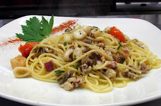
Seafood Spaghetti

Spaghetti bolognese

Veal Mamma Mia 

Tortellini Buongustaio

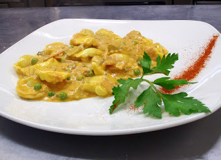
Tortellini Formaggio

Friday, 25 May 2012

Core project: Task 6 Photoshoot 1 Final images

Flannels:

Wood Pigeon Black and White Pudding With Textures Of Artichoke

Textures on Rabbit  

Vegetarian Tart Tatin

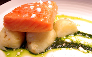
 Sea Trout Buttered Jersey Royals & Wild Nettle Pesto

Twice Baked Yorkshire Blue Souffle

Chai Tea Parfait

Yorkshire Mess 

 Crab Risotto, Avocado Frozen Espuma

Vegetarian Mezze

 Duck egg & Soldiers

My original technique for photographing food was a low iso 200 for my camera, lots of close ups of the food different angles and use a low f number e.g. around 5.6. When i got to Flannels to take the photographs but for some photographs i had to change my settings because either not everything was in focus, the image was too dark or my shutter speed was very low if i had a tripod would have been better which was my mistake. But my setting were 200 ISO, 60th and below shutter speed f number 5.6 - 10 and the white balance was on auto. 
When i was in the kitchen I had to boost up all my settings my iso went to 400, my shutter speed was 125th and above and my white balance was on fluorescent warm white and my f number was changed from f5.6 to f10. 
The main part of my photographs I wanted to be natural lighting because when i went into the kitchen the fluorescent light bulbs discolored the plates and gave a redy/pinky look to them but in Photoshop I managed to use the levels tool to change the colour on the photographs back to white like this:


This technique was very useful for my photographs because the white balance was off and I have used it on all my photographs its a bit frustrating and tricky trying to find the perfect level without overexposing the food too much. 

Monday, 21 May 2012

Core project: Task 4

How visual language communicates ideas and meaning.

A commercial photographer could be described as a fashion/studio photographer who makes their models look as beautiful and thin as they can in a studio or controlled area. They use equipment in order to do this for example backdrops, soft boxes, umbrellas and light boxes. The images taken from studio photography can be used in magazines as their front cover. This links into journalist photography because if a celebrity is featured on the front cover then a journalist will take photographs of the featured celebrity which look very different to the cover image as they have been beautified.


Whereas a journalist follows a celebrity for as long as they need to to get a story about them which they can sell on to magazines. A journalists equipment is a zoom lens and a very good disguise so they can blend in whilst getting their story. Another technique a journalist uses is trying to make a celebrity look as bad as possible by the angles of photographs taken e.g an upward angle in the streets or places the celebrity go for example clubs and the celebrity comes out drunk. The photographs taken of celebrities in bad poses are then used in magazines, newspapers and are sometimes featured on the news.


This is the Pieta painted by Annibale Carracci. Pieta means pity in Italian and was painted in the 16th century. 
 This painting is of Supper at Emmaus by Caravaggio in 1606.
This photograph is by Georges Merillon taken in 1990 showing a family and neighbours grieving after a member passed away.


I have chosen these three images because they are different in time but the same in content or composition, when the photographs are laid out like this you can see the similarities. For example the predominate figure in the middle, with something across the bottom third also people crowded around the predominate figure and the object/person laying across the bottom. Although the photographer and the painter of the Pieta are from a different time they have the same techniques within their painting or photograph. One of the main techniques all the images have in common is lighting  from one side of the image. This technique is used to symbolizes grief, sorrow and moodiness and it does convey that message.
Another photograph which copies this style is an advertisement for the colours of Benetton clothing that I found:
Again this follows the same composition of crowding around a person. As the Pieta is very well famous Benetton have used it within their advertisement to raise awareness of AIDS. When you see these photographs with someone clutching onto another person you do immediately think of Mary holding Jesus when he died but you also do feel compassion for the people within the photograph.  I think the painting of the Pieta will be used for many images to convey sorrow.